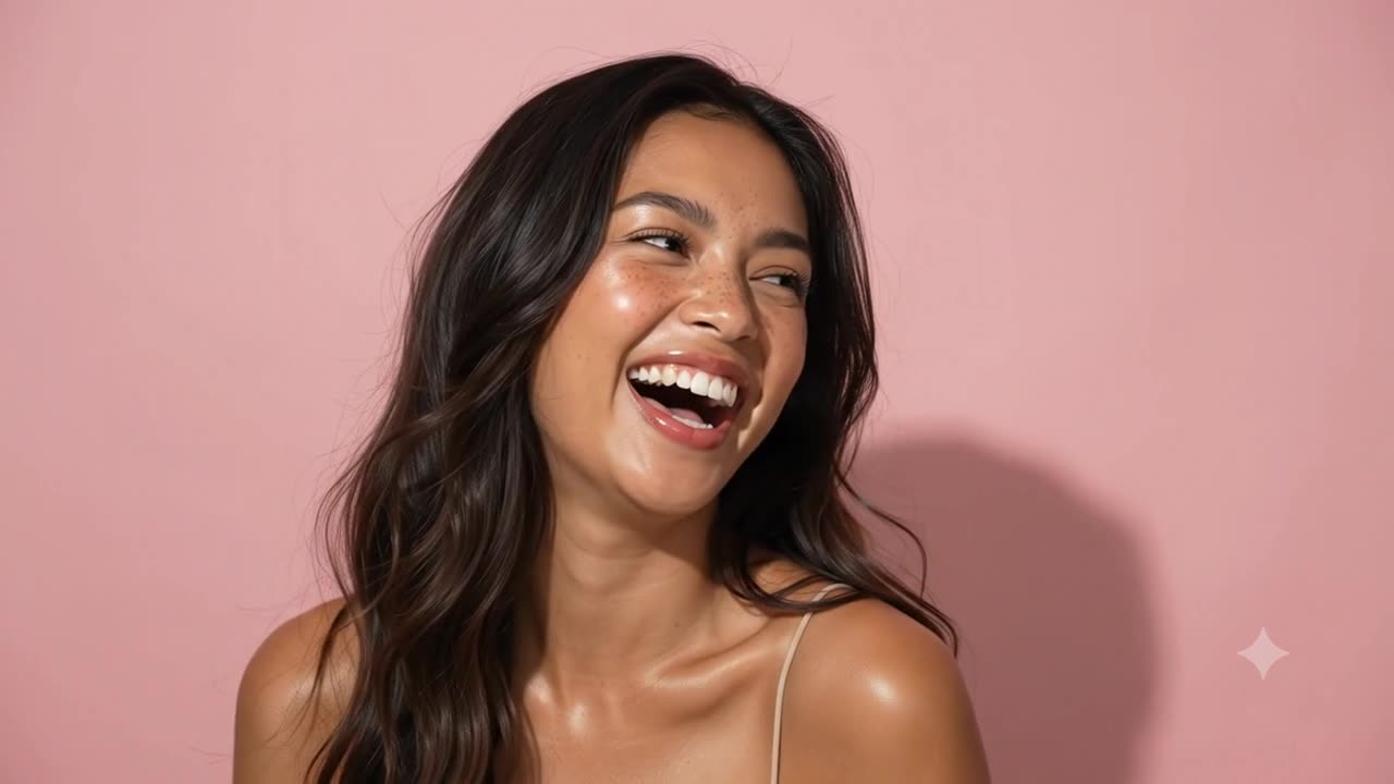
Short answer: AI portraits usually look fake because of lighting inconsistency rather than skin texture. If the shadow on the wall implies a light source in one position while the face is lit from another, the picture contradicts itself and no amount of texture detail will fix it. Naming one light source and requiring every shadow to match it changed my results more than any skin instruction.
Every image in this post is AI-generated. I am saying that at the top rather than the bottom because the whole point of what follows is being able to tell.
I wanted to answer one question. When an AI portrait looks wrong, is it because the prompt needs more detail, or because it needs to be more exact? Those sound similar and they are not. One is solved by writing more. The other is solved by writing differently, and if you get the diagnosis wrong you can spend an afternoon adding adjectives to a prompt that was never short of adjectives.
So I wrote two prompts and built them the same way, with the same sections covering skin, expression, lighting and camera. The first was a beauty portrait of a laughing woman against a pink background. Once that one was working, I wrote a second prompt from scratch for a different style of portrait entirely: a close crop with a hand at the face and painted nails, based on a reference image I liked. The point of the second one was to find out whether the approach held up on something unrelated, or whether I had just tuned a prompt to one picture. I ran both through free Gemini and ChatGPT Plus, added to them each round, and kept every version including the ones that went badly.
Why naming beats describing in an image prompt
The single most useful change I made early on had nothing to do with length. It was swapping vague quality words for the actual names of things.
Asking for highly detailed skin does very little. Naming a specific structure does a lot, because that phrase exists in captioned reference images and the model has something to anchor to. Compare these two:
Highly detailed, realistic skin with lots of texture.
Pore structure retained and visible on the nose and inner cheeks, finer at the temples, distribution uneven rather than uniform. Fine vellus hair along the jaw catching the light.
That second version is lifted from the beauty prompt exactly as I wrote it.
The second one is not longer by much. It is more specific about what, and that is the part that matters. The same principle applies across the face. Vermilion border rather than lip edge. Gingival margin rather than gum line. Limbal ring rather than the dark bit around the iris. Subsurface scattering rather than the skin looking soft.
This part is not folklore. Research on training people to detect synthetic faces uses texture as one of its core assessment categories, asking participants to judge whether skin appears unnaturally smooth or irregular. Skin is one of the first places a synthetic face gives itself away, so it is worth being precise about.
Why the same prompt gives different results in Gemini and ChatGPT
This is the first brief, the beauty portrait. Once the skin instructions were working, I ran it through both tools and got two very different photographs.
One stayed tight on the face, close crop, red lips, strong brows. The other backed off to a waist-up shot and put her in a white halter top.
I had said nothing about clothing. I had said nothing about how far back to crop. So the difference between those two images was entirely made up of things I had left out, and each tool filled the silence differently.
That reframed how I thought about prompt length. Adding detail is not padding. It is closing gaps, and any gap you leave will be filled by something you did not choose.
What actually makes an AI portrait look real
By the fourth round I had a list of three things that changed the output more than anything else, and none of them were about skin.
Asymmetry. Real faces are visibly uneven and models default to producing symmetrical ones. I started asking explicitly for one eye squeezing shut further than the other and the mouth pulling higher on one side. Detection research treats facial symmetry and proportions as a category of its own, right alongside texture, which tells you it is doing independent work.
Lighting. Naming one light source and where it sits gives every shadow in the frame something to obey. Without that you get a face lit from nowhere in particular, which reads as flat even when the skin is perfect.
Camera. Saying which lens, how much of the frame is in focus, and that there is grain in the shadows adds the flaws that come from equipment rather than from the person. This one matters more than it used to. Hany Farid, who helped found the field of digital forensics, has noted that early AI images were spottable through unrealistic sensor noise, but that models now reproduce those patterns well enough that pixel-level statistical detection no longer works on its own.
To be clear about something I got wrong at first: none of these replaced the skin work. Detection research lists texture, symmetry and lighting side by side rather than ranking them. These three were what was still missing after the skin was already working.
How much does the camera section of a prompt change?
This is the second prompt, the different portrait style. Because I wanted to see how much of the image the camera section was actually controlling, I ran that prompt twice in Gemini and changed nothing except the camera paragraph. One version said it was shot on an iPhone 14. The other specified a 100mm lens.
Nothing about the skin, the lighting or the expression moved. The framing did. The depth of field did. The way the hand sits against the face did, because a wide phone lens held close enlarges whatever is nearest to it.
I measured the background sharpness afterwards out of curiosity. In the iPhone version the wall holds almost no detail relative to the face. In the 100mm version it holds more than twice as much. That is the opposite of what you might assume from the phrase shallow depth of field, and it is a good reminder that these instructions are doing real work rather than decorating the prompt.
Does the facial expression matter in an AI portrait prompt?
More than I expected, and the mouth is the part that gives it away.
I stopped asking for a smile and started naming the muscles. The prompt asked for a Duchenne smile with the orbicularis oculi engaged, lower lids pushed up into crescents, and crow's feet radiating from the outer corners. That combination is what separates a genuine laugh from a posed one, and the distinction is well established in expression research, where the Facial Action Coding System decomposes expressions into individual muscle movements called Action Units rather than just labelling a face happy or angry.
The mouth got the same treatment. Upper teeth exposed with the gum line visible, teeth a natural ivory with translucency at the biting edges, the two central incisors visibly different in width, one lateral incisor slightly rotated, and a soft vermilion border rather than a drawn line.
That specificity is worth the words, because the mouth is where people look when they suspect an image. In a study comparing dynamic face stimuli, participants who described faces as fake or computer-generated most often pointed at the mouth and the facial proportions as the parts that did not behave naturally.
There is also a finding worth knowing before you choose an expression at all. When researchers tested how accurately people read emotions in AI-generated faces, agreement was high for sadness, anger and happiness at 87%, 73% and 69%, and collapsed for fear, surprise and disgust at 3%, 9% and 14%. The emotion you pick changes your odds before you write a single word about muscles. A laugh is a much safer brief than a look of disgust.
The lighting mistake that makes AI portraits look wrong
By round five the images were good enough that I could not say what was wrong with them, only that something was.
It was the shadow.
In one version there was a soft dark shape on the wall behind her, sitting off to her left and fairly high in the frame. For that shadow to exist, the key light would have to be well off to her right. But her face was lit almost flat, with both cheeks similarly bright and a small shadow falling straight down from the nose. That is a frontal light source above the lens.
A light cannot be in two places. The image was not unrealistic so much as internally contradictory, and no amount of asking for more realism was going to resolve a contradiction.
This turns out to be well documented. Farid writes that AI-generated images exhibit many of the properties of natural scenes while cast shadows and reflections remain inconsistent with the perspective geometry those scenes imply. A 2025 survey of AI-generated media detection groups this under high-level forensic methods, which analyse geometric information such as abnormal lighting, shadows and reflections.
The fix was one sentence added to the background paragraph:
No shadow appears anywhere the key light does not explain.
Worth being clear about what that line does, because it reads like a ban on shadows and it is not. It does not remove anything. It tells the model where a shadow is allowed to sit, which is only in places the light source can account for.
There is no additional description in that line. It does not name a single new texture. It asks the picture to agree with itself, and it changed the output more than every skin instruction I had written up to that point.
I measured the difference afterwards. Before the line, the wall behind her ran bright, then dark, then bright again, which is a dark band with lighter wall on both sides rather than a shadow. After the line, it started bright and fell off steadily as it approached her, which is how a shadow behaves when something blocks a light.
Why shadow errors are so hard for people to spot
I felt slow for missing it. It turns out this is a known limitation of human vision rather than a personal failing.
Nightingale, Wade, Farid and Watson ran a study asking people to judge whether shadows and reflections in a scene were physically possible. Participants largely could not do it, and when explaining their reasoning they rarely mentioned lighting or shadow inconsistencies at all, relying instead on non-image cues like the credibility of the source or the caption attached to the picture.
Which is worth sitting with. The thing most likely to be wrong in an AI image is the thing our eyes are worst at checking.
Do AI image benchmarks tell you which tool to use?
I used free Gemini and ChatGPT Plus, and people will reasonably ask which is better.
The leaderboards have an answer. GPT Image 2 currently leads the Artificial Analysis Text to Image Arena with an Elo of 1338, with Gemini's Nano Banana 2 at 1261. Those ratings come from blind pairwise voting, where people see two images generated from the same prompt without knowing which model made each and pick the one they prefer.
It is worth understanding how that number is built. Artificial Analysis generates more than 700 images per model, across prompts spanning portraits, groups of people, animals, nature and art, then calculates Elo through a regression across all those preferences. So a leaderboard position tells you which model people preferred on average, across a wide mix of categories, at whatever prompt quality the average voter writes.
For plenty of work that is exactly what you want to know. People compare coding tools this way constantly and the numbers are genuinely useful there. For what I was doing, one narrow corner of one category with a five hundred word prompt, I preferred the higher-ranked tool on some rounds and the other one on others.
There is also published criticism of how arena leaderboards work. The Leaderboard Illusion, presented at NeurIPS 2025, audited Chatbot Arena and found undisclosed private testing that lets some providers evaluate multiple variants and retract scores, producing biased ratings through selective disclosure. The authors argue that when a leaderboard stops representing real performance gains, it pushes people toward optimising for the metric rather than for actual usefulness. That paper looks at language models rather than image models, so I would not apply it directly here, but the mechanics it describes are the same mechanics. Separately, researchers building K-Sort Arena note that arena algorithms require very large numbers of comparisons to produce stable rankings and are vulnerable to preference noise, and say the same issues apply to visual generative model arenas.
None of that makes the leaderboards worthless. It makes them a starting point rather than an answer.
Why photographers get better results from AI image tools
The AI ads and short films that genuinely look good are mostly being made by photographers and cinematographers, and it is not hard to see why. They already know what a 35mm lens does to a face, where light should fall, and what a real shadow looks like on a wall.
At SXSW 2026, producer Gregory Jensen made the point that the models do not arrive with that knowledge, and that it is the director who knows which lens they wanted and what the lighting was supposed to be. The takeaway from that panel was that craft knowledge of lighting, colour and camera is the filmmaker's biggest asset, and that AI is the engine rather than the steering wheel.
A production studio using these tools on paid client work put it in similar terms, describing an enormous difference between what a first-time user gets out of these models and what someone gets who understands how to phrase camera language and describe light.
I follow a lot of these people on LinkedIn and Instagram, and the work is genuinely good. Not good for AI. Good. If I look closely I can usually find one tiny thing that gives it away, but I have to look, and finding it does not really diminish what they made.
All I have really done here is borrow their vocabulary and point it at a prompt box. I am not close to what they do, and I do not think a few weeks of reading anatomy terms puts me anywhere near someone who has spent fifteen years lighting faces for a living.
What still looks wrong in these AI portraits
If you look at the images in this post at full size you will find things.
The freckles move between runs, so they are decoration rather than a consistent feature of a consistent person. Some of the skin still reads a little too even. The nails in one of the hand shots curve in a way that does not quite follow the finger underneath. I am showing you what improved across six rounds, not something finished.
This is useful when a small brand cannot afford a shoot. It is not the same as booking one.
How to write a photorealistic AI portrait prompt
Start with the physics, not the surface. Lighting, shadow, camera and asymmetry first. Skin texture second. I did it the other way round and spent days polishing a face that was sitting in an impossible room.
State one light source and where it is, then require everything in the frame to agree with it. That single instruction is worth more than a paragraph of texture words.
Change one section at a time. The camera test was the most informative thing I did all week, and it only worked because everything else stayed fixed.
And check the output the way a forensic analyst would rather than the way a proud parent would. Teeth first, then catchlights, then hair against the background, then the shadow.
One last thing worth saying. The shadow instruction was written for a beauty portrait and it worked just as well on a completely different brief with a hand, painted nails and a different subject. That is the part I would trust. A fix that only works on the image you invented it for is not a method, it is a coincidence.
Frequently asked questions
Why do AI portraits look fake even with detailed prompts?
Usually because parts of the image contradict each other rather than because any single part lacks detail. The most common contradiction is lighting: a cast shadow implying one light position while the face is lit from another. Adding more texture description does not resolve a contradiction.
What is the most useful single line to add to an AI portrait prompt?
In my testing it was requiring internal consistency in the lighting, phrased as no shadow appearing anywhere the key light does not explain. That is not an instruction to remove shadows, it is an instruction about where they are allowed to sit. It adds no description at all, and it changed the output more than any texture instruction.
Does skin texture matter in AI portrait prompts?
Yes. Naming specific structures such as pore distribution, vellus hair and subsurface scattering works considerably better than asking for detailed or realistic skin. Research on training people to detect synthetic faces treats texture as a core assessment category alongside symmetry and lighting.
Is free Gemini or ChatGPT Plus better for AI portraits?
It depends on the task. GPT Image 2 leads the Artificial Analysis arena on Elo, but those ratings average preference across portraits, groups, animals, nature and art. Across six rounds on one narrow use case I preferred each tool on different rounds, and refining the prompt moved results further than switching tools did.
Does the facial expression matter in an AI portrait prompt?
Yes, and the mouth matters most. Naming the muscles rather than the mood works better, so asking for lower lids pushed up into crescents and crow's feet radiating from the outer corners produces a more convincing laugh than asking for a smile. Choice of emotion matters too: people read AI-generated sadness and happiness accurately far more often than fear or disgust.
How do you tell if a portrait is AI-generated?
Check the teeth for repeated shapes, both catchlights for matching position, hair edges against the background for haloing, and most importantly whether the shadows agree with the light direction on the face. Human observers are demonstrably poor at that last one, which is why it survives.
A note on what is cited and what is not
Every link in the list below goes to a source I read rather than to coverage of it. Where I have described a measurement of my own, such as the wall brightness readings, that is my own analysis of my own images and should be treated as one person's observation rather than as research.
Both prompts are written out in full on a companion page, along with the camera variation and the vocabulary bank organised by facial region: the full AI portrait prompts. Free to copy, no signup.